
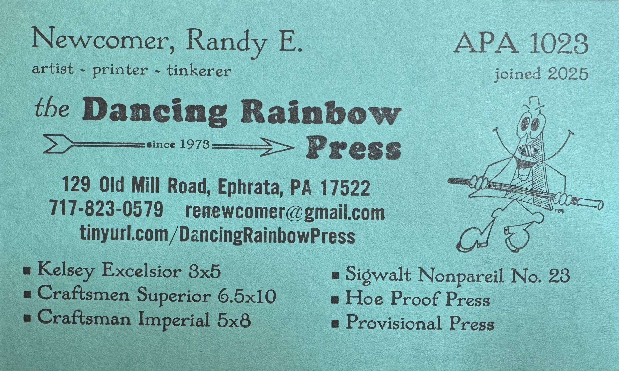
This year I was accepted as a member of the Amalgamated Printers Association so the first thing I had to do was update my prop (proprietor’s) card to meet the membership requirements. I initially planned at least two colors and the APA logo, but a perfect storm of press and other issues made it necessary to simplify the project. I used the Craftsmen Imperial 5×8. Yes, I also satisfied having my first typo, it’s “men” not “man”. I can never keep that straight so with the Superior “men” and Imperial “man” one of them was sure to be right. Clue, they were not made by Sears, which made the Craftsman brand.
Colophon: Newcomer… Colwell Handletter 18pt / artist… Colwell Handletter 10pt / the… Colwell Handletter Italic 18pt / Dancing… Cooper Black 18pt / 129 Old… Alt Gothic #1 12pt / Kelsey… Colwell Handletter 12pt
Paper: French Paper Poptone Blu Raspberry 100# Cover / Ink: Gray custom mixed.
The dancing rainbow graphic was a drawing of mine of the Press’ namsake and had made into a cut in the early days over fifty years ago. (see Dancing Rainbow History)